QA Dashboards: Building One People Still Open in Month Three
Most QA dashboards are built in week one and abandoned by month three. A guide to designing around decisions rather than available fields, the charts worth having, and the ones that quietly mislead.
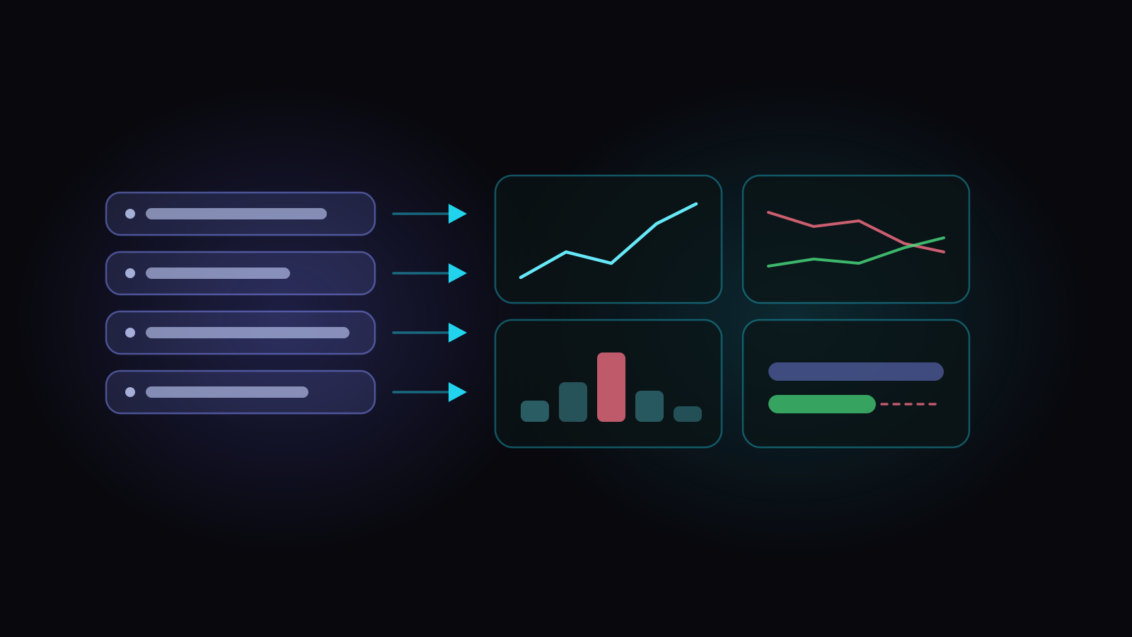
A QA dashboard is a standing answer to a small number of recurring questions. Not a display of available metrics — a set of answers to things somebody asks often enough that looking them up by hand has become annoying.
That definition rules out most QA dashboards, which is the point. The typical one is built in an afternoon from whatever the tool offered, looks impressive in the retro where it’s unveiled, and is dead by the third month. Not because anything broke — because nobody could say what any panel was supposed to change.
Why dashboards die
Three causes, in roughly this order.
They were built from fields, not questions
An empty chart builder asks four questions before you get anything: which data source, which dimension, which aggregation, which visualisation. Answering all four correctly requires already knowing what you’re looking for. So people plot what’s easy — status distribution, test count by priority — rather than what’s worth knowing, and end up with charts that are accurate and pointless. The reverse — choosing a question and letting the chart follow from it — is the step a blank builder leaves to you.
They show state without movement
A pie chart of current test statuses tells you where things stand and nothing about where they’re going. Almost every QA question that matters is about direction — is coverage improving, is the defect backlog growing, are we automating faster than we’re writing — and direction needs a time axis.
Nobody owns them
A dashboard with no owner drifts. A filter that was right in March is wrong in September; a chart pointed at a folder that’s since been reorganised now shows nothing and nobody notices. Six months on, people have quietly learned not to trust it, which is worse than not having it.
Design from the question backwards
The useful exercise takes ten minutes: write down the questions your team actually asks in standups, release meetings and retros. Then keep only the ones where the answer would change what somebody does.
You’ll usually end up with five to eight, and they tend to look like:
Anything that doesn’t earn a place on that list can be a report you run on demand. Dashboards should be short: a panel nobody looks at costs attention from the ones they do.
Charts that carry information, and ones that don’t
Trends over snapshots. A line over eight weeks beats a number today for almost every QA metric. The number tells you where you are; the line tells you whether what you’re doing is working.
Rates with their denominators. Pass rate without “how much has been executed” is a biased sample early in a cycle. If a panel shows a percentage, it should show the base.
Distribution over average. Average defect age hides the one ticket that’s been open for 400 days. Show the distribution, or at least the oldest.
Absolute counts, carefully. “142 test cases” isn’t information unless something compares it — to last month, to a target, to another area.
- 37 open defects, todaythe same number over eight weeks — is it working?
- 96% pass rate96% of the 25% executed so far — the rate with its base
- 11 days average defect agethe distribution — and the one open for 400 days
- 142 test cases142 against last month, a target, or another area
Keep the numbers agreeing with each other
The fastest way to kill trust in a dashboard is for it to disagree with a report. If the scorecard says coverage is 71% and the coverage report says 68%, both are now suspect, and every other number on the screen loses authority with them.
This happens through ordinary maintenance rather than carelessness: two independent implementations of “coverage” get patched separately over a year and drift apart. The fix is structural: the dashboard should take its numbers from the same calculation the report uses, not keep its own copy.
How this works in Hawzu
Observatory turns the blank-builder problem around: you choose a question, and the chart follows from it. Click Add Insight and the first thing you see is Smart Insights, a list of ready-made questions — “How fast are we automating our test suite?”, “Which priority tests still rely on manual coverage?”, “Are defects staying closed?” Picking one sets the data, the grouping and the chart type for you, because those were never the interesting decisions.
Insights are grouped into categories that each carry a one-line purpose rather than just a name (“Find gaps in protection”, “Gauge stability and flakiness”), and empty categories don’t show — a grid of headings where three are blank teaches people to skim past headings.
Collections go a step further: a named bundle of insights built for a named audience, added to a panel all at once, so a QA manager’s view isn’t assembled one chart at a time. The Custom Builder is still there for the things nobody anticipated. It just isn’t the front door. And if the question you want isn’t on the list, Suggest an insight lets you ask for it.
The Project Health scorecard grades automation, coverage, execution, quality and defect health, and it’s built to agree with the rest of the product. It doesn’t work out its own figures; it reuses the ones behind the Coverage report, the Execution Summary and the defect-aging views.
The number worth knowing about lives in the Coverage report: stale automation, the cases marked automated that no build has run recently (30 days, unless you change the window). It sits beside what your pipelines actually ran, and the gap between the two is the finding: automation that quietly broke, or automation that never existed. It has been inflating your coverage number for as long as nobody looked, and you can’t ask a chart builder for it, because you’d have to know to ask.
Charts also carry a short written summary: a message, the reason behind it, and an action — “High priority test cases still lean heavily manual”, then the counts, then what to do about it. That’s the difference between a dashboard and an observatory: one displays, the other is pointed at something.
Observatory, panels and insights
Key takeaways
- Design from the questions your team actually asks, and keep only the ones where the answer changes a decision. Five to eight panels is usually the whole list.
- Prefer trends to snapshots — almost every QA question that matters is about direction, and direction needs a time axis.
- Always show a rate’s denominator. Pass rate without “how much was executed” is a biased sample.
- Skip the status pie chart and the executed-tests leaderboard. One shows state without movement; the other measures typing.
- Make the dashboard read the same computation your reports do. Two numbers that disagree cost you trust in every number beside them.
- Give it an owner. An unowned dashboard drifts into being quietly wrong.
Common questions
What should a QA dashboard show?
Why do QA dashboards stop being used?
What QA metrics belong on a dashboard?
Is a test case status pie chart useful?
Should QA dashboards track individual testers?