QA Test Reporting: Reports People Actually Read
Most QA reports are written for nobody in particular and get skimmed once. A guide to choosing the report for the audience, the four numbers worth leading with, and why a report that recalculates isn't a record.
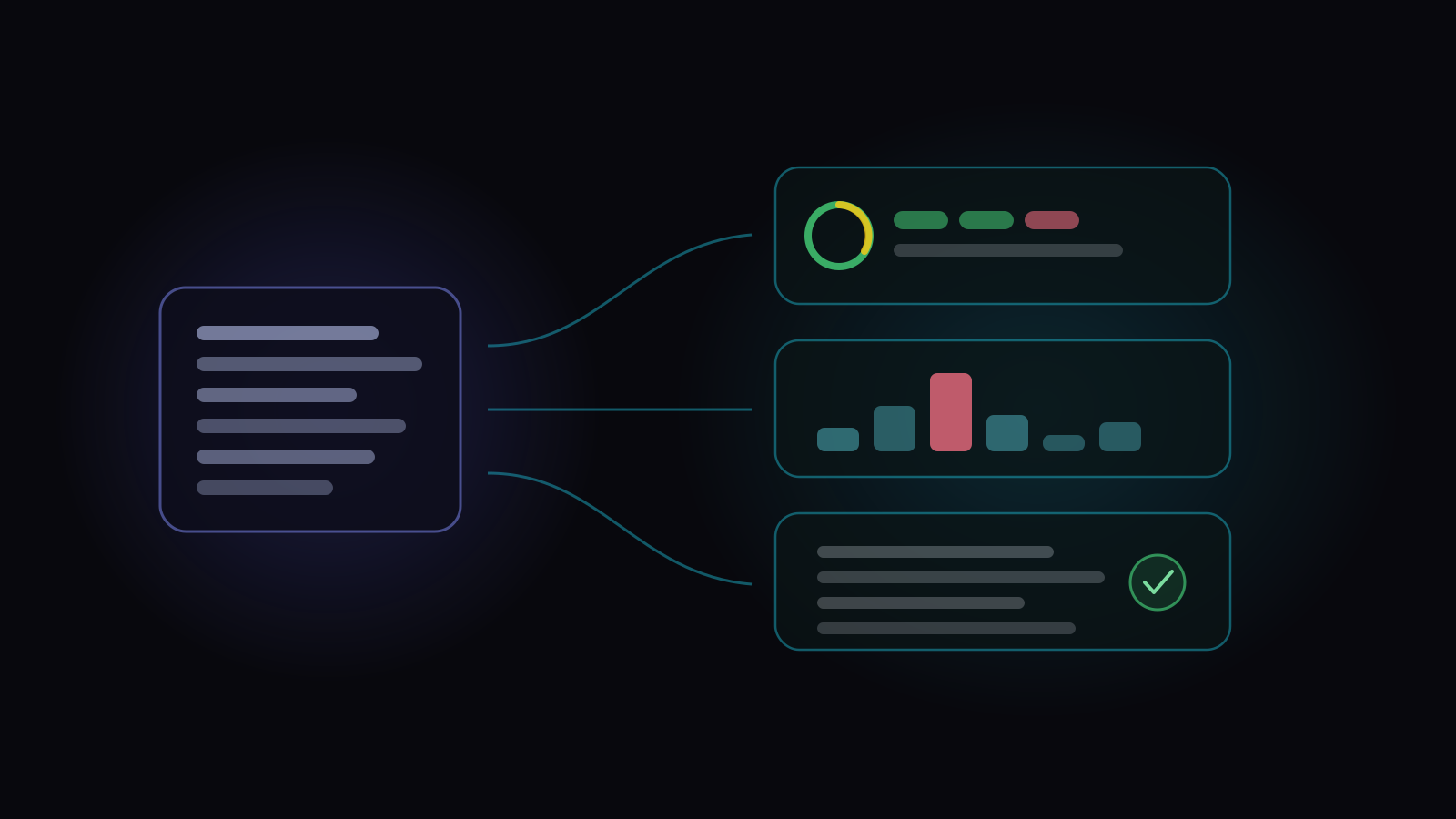
QA test reporting is turning testing activity into something a specific person can act on. Not a summary of everything that happened — a targeted answer for someone who has a decision to make.
That distinction is the whole game. Most QA reports fail not because the numbers are wrong but because they were written for “the business”, which is nobody. A release manager, an engineering lead, a compliance auditor and a CTO want four different documents built from the same evidence, and a single report that tries to serve all four serves none of them.
Start from the reader, not the data
Before choosing what to include, answer two questions: who is reading this, and what will they do differently depending on what it says? If there’s no answer to the second, the report doesn’t need to exist.
The release manager: can we ship?
Wants a verdict and the reasons behind it. Coverage of what this release changed, what’s failing, which defects are open and how bad they are, and what’s blocked. Everything else is noise at this moment.
The engineering lead: where is it weak?
Wants failure concentration — which areas fail repeatedly, which tests are flaky, where automation has stopped running. This reader is looking for a place to spend effort, so relative signal matters more than absolute totals.
The auditor: prove it
Wants traceability and evidence. Which requirements were covered, by which tests, executed by whom, when, with what result. Crucially they want it as it was at the time, not as it is now — which is a storage decision before it’s a reporting one, and the reason a sign-off has to be frozen rather than recomputed.
The executive: is this getting better or worse?
Wants trend and exception. One or two numbers over time, and a plain-language note about anything unusual. A twenty-metric dashboard emailed monthly is read once.
A report that looks impressive and says nothing
Before the metrics, an example. Here is a QA summary of the kind that gets pasted into a release thread on a Thursday afternoon: four numbers, all of them green, none of them false.
Nothing there is a lie. Every figure would survive an audit. The report is still useless for the only decision anyone was going to make with it, because each number is missing the thing that gives it meaning — and the one measure that should have stopped the release isn’t on the page.
The rest of this section takes those numbers in the order they appear above and does each of them properly.
The numbers worth leading with
Whatever the audience, a small number of measures carry most of the information — and a few popular ones carry less than people think.
Pass rate, with its denominator
Pass rate on its own is close to meaningless because the denominator moves. 95% of what? Of the tests run so far, which early in a cycle is a biased sample of the easy ones. Always report it beside how much was executed — 95% of 40% executed is a very different sentence.
Coverage, against something specific
“80% coverage” needs an object. Coverage of the requirements in this release is actionable. Coverage of your whole test suite is a statement about how much of your own backlog you got through, which is a different and much less interesting claim.
Failure concentration, not failure count
Twelve failures spread across twelve areas is a bad day. Twelve failures in one area is a finding. Report where failures cluster — by folder, component or requirement — because that’s what tells someone where to look.
What’s open, weighted by severity
An open-defect count treats a typo and a data-loss bug as equal. Break it down by severity, and separately report anything critical, because in practice a single critical open defect outranks every other number in the report.
Reports that recalculate aren’t records
This is the failure that surprises teams, and it only shows up months later.
Most reports are a live view: they run a query when you open them. That’s correct for “how are we doing right now”. It’s wrong for anything that documents a decision, because the inputs keep moving. Defects raised during a cycle get closed, reopened and re-linked afterwards. Open a sign-off report six months later and it will quietly disagree with the email that announced it.
Any report that records a decision — a sign-off, an audit response, a release certificate — needs to be frozen at the moment it was produced, or exported to a static document and stored somewhere that doesn’t recompute.
Practical habits
- Send less, more often. A short weekly note gets read; a comprehensive monthly deck does not.
- Lead with the exception. Open with what’s unusual, not with a table. If nothing is unusual, say that in one line and stop.
- Say what changed since last time. Absolute numbers without a delta make the reader do the comparison, and mostly they won’t.
- Name the action. “Coverage of the payments requirement is at 40% with three days left” is a report. “…so we’re extending the cycle or descoping” is a useful one.
- Keep the export. Whatever tool you use, the version that matters later is the file you attached to the ticket, not the URL.
How this works in Hawzu
Seven reports, each scoped to a project with a shared date-range filter, and — worth noting for the audit case — all of them readable by a read-only Project Viewer, so a stakeholder can pull their own without an account that can change anything.
Each answers one of the questions above, and ends in a decision:
- Can we ship? → Release Readiness → a readiness verdict you can argue with: Ready, At risk, Not ready or Not started. Behind it sits a score out of 100 with its parts on show — Test Execution, Quality, Defect Health and Requirements (left out when nothing is traced). Hard checks can override the score outright, so a strong average can’t bury an open critical.
- Where is it weak? → Test Execution Summary, Flaky Tests and Automation Health → where to spend the next week. The summary gives pass rate, passed, failed, blocked and not-executed over a window, a per-execution table with an attention signal, and top failing folders — concentration rather than a raw count. Flaky Tests sorts tests into stable, flaky and unstable from their recent runs, counts how often each one flips between pass and fail, and separates probable breakages from genuine noise. Automation Health reports what your pipelines run that Hawzu can’t match, and where their time goes.
- Prove it. → Requirement Traceability Matrix and Coverage → an answer that still holds in a year: every requirement against the tests covering it and the defects they caught, with risk factors named rather than colour-coded.
- Who is carrying this? → Authoring & Execution Activity → where the load actually sits: who wrote, executed and triaged over a window, each person’s dominant role, new contributors, and quiet contributors — people previously active who’ve gone silent.
Two honest gaps in that mapping. The last one isn’t an audience from the list above — it’s a team question that turned out to be worth its own report. And the executive question, is this getting better or worse?, has no dedicated report at all: it’s answered by reading a trend across the others, which is exactly the job a dashboard does better than a document.
Six of the seven export to both PDF and Excel (Automation Health is the exception, and the docs say so). The PDF export opens a section picker and remembers your selection, which matters more than it sounds when you produce the same report every fortnight.
For the record-versus-live distinction, sign-off reports are the frozen ones: defect figures are locked when you complete the run or the release, and marked with an “as of” date, so the document doesn’t drift as defects move afterwards.
The reports Hawzu ships
Key takeaways
- Pick the reader first. Four audiences want four documents from the same evidence, and one report for all of them is read by none.
- Never report pass rate without how much was executed — the denominator moves and it’s a biased sample early on.
- Report failure concentration, not failure count. Where they cluster is the finding.
- Distrust composite scores shown without components. Averages let a strong dimension hide an open blocker.
- Separate live reports from record reports. Anything documenting a decision must be frozen or exported, or it will quietly disagree with itself later.
Common questions
What should a QA test report include?
How often should QA reports be sent?
Is pass rate a good QA metric?
What's the difference between a QA dashboard and a QA report?
What is a test execution report?
What is a QA release readiness report?
How do you report QA status to executives?