Building an Observatory Instead of Another Dashboard
A blank chart builder gets called flexibility, and it hands the reader a research project. Observatory starts from the question instead — and the presets, categories and role bundles all exist to keep it that way.
Every QA team builds a dashboard in the first month. Pass rate, defects by severity, tests by status, a pie chart of something. It looks great in the retrospective where it’s unveiled.
By month three nobody opens it.
The charts aren’t wrong. They’re accurate, they refresh, they render. The problem is that nobody can say what any of them is for — what decision changes if the donut shifts by six percent. They were built because the tool offered a chart builder and those were the fields available.
Why that happens, and how to design a dashboard people still open, is its own guide. This post is the other half: what we built instead. Observatory is Hawzu’s QA analytics area, where you pick a question — how fast are we automating our test suite? — and the chart is whatever answers it.
A blank chart builder is a question you’re being asked to answer
Hand someone an empty chart editor and you’ve handed them a research project. Pick a data source. Pick a dimension. Pick an aggregation. Pick a visualisation. Every one of those is a real decision, and getting all four right requires already knowing what you’re looking for.
So people pick what’s easy to plot rather than what’s worth knowing. Status distribution is easy. “Which of our automated tests hasn’t actually run in a build?” is not — and it’s the one that would change what you do this sprint.
Flexibility isn’t a feature if it costs the user the answer.
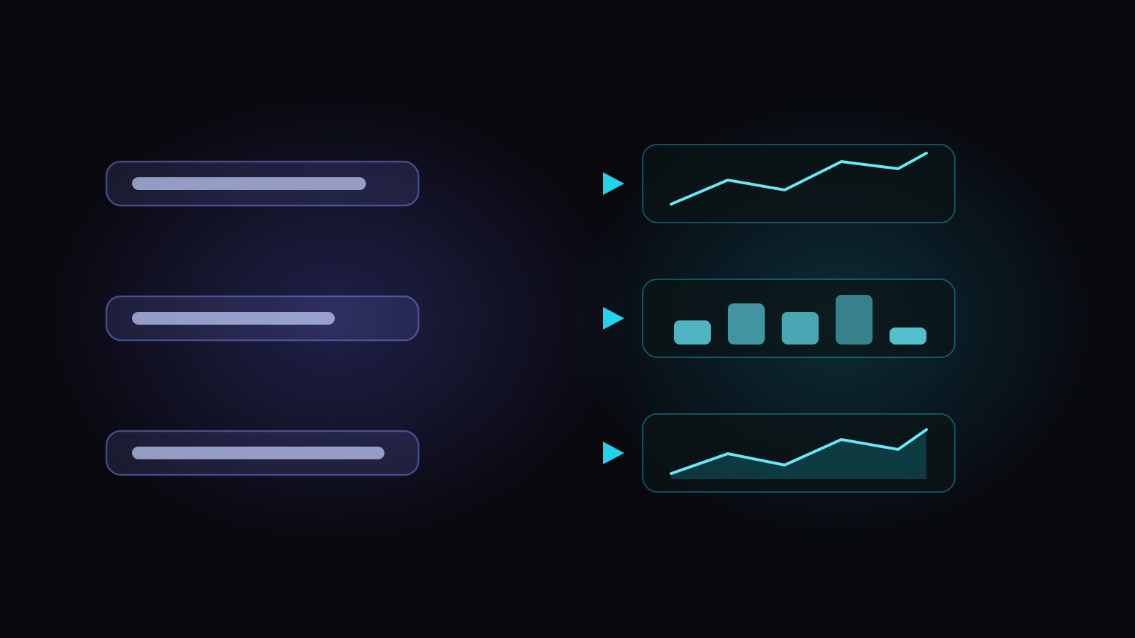
- How fast are we automating our test suite? Repositoryover timeline
- Which priority tests still rely on manual coverage? Repositoryby prioritystacked bar
- Are defects staying closed? Defectsstatus trendarea
Every ready-made insight carries its question alongside its title — “Are defects staying closed?”, “Which priority tests still rely on manual coverage?”, “Are all requirements backed by tests?” Picking one with Add Insight settles all four of those decisions for you, because they were never the interesting ones. They were the tax.
The custom chart builder still exists, and it should — occasionally you genuinely need something nobody anticipated. It’s just not the front door.
An empty heading teaches people to skim
The insights are grouped — Coverage, Automation, Execution, Quality, Defects, Requirements, Release Health, Team — and each group carries a one-line description of what it’s for rather than just a name. “Find gaps in protection.” “Gauge stability and flakiness.”
Empty categories aren’t rendered at all. A grid of eight headings where three have nothing under them trains people to skim past headings, and after that the grouping is decoration rather than navigation.
Collections go further: one click adds a whole set of insights chosen for a role, because a QA manager’s view isn’t the same six questions as a developer’s. If an insight in a collection is later renamed or retired, the collection simply leaves it out instead of failing — renaming an insight should never be able to break somebody’s dashboard.
The number that catches automation lying
The scorecard is where question-first stops being an interface idea and starts paying off.
Alongside the usual automation percentage — computed from what your test cases claim — there are three more: how much automation is confirmed by build evidence, how much is unclaimed, and how much is stale.
Stale automation is the actionable one. A test case marked automated that no build has ever run is either automation that quietly broke, or automation that never existed. Either way it has been inflating your automation percentage, and the inflation compounds silently for as long as nobody looks.
You cannot get to that number from a chart builder, because you’d have to know to ask for it.
Numbers that agree with the pages they came from
One decision behind the scenes does more for trust than anything visual.
The scorecard doesn’t work out its own coverage, execution and defect figures. It takes them, unchanged, from the same calculations behind the Coverage report, the Execution Summary and the defect-aging views.
The reason is the failure it prevents. Separate calculations of “coverage” drift — not through carelessness but through ordinary maintenance, each one patched separately over a year. Then the scorecard says 71% and the coverage report says 68%, both are defensible, and every number on the screen loses authority at once. It’s the same argument that moved readiness scoring out of the browser after three copies produced two answers.
The 0–100 grade is laid on top of those measurements afterwards, and never changes them. Scoring is presentation; the measurements are the product.
An insight that ends in a verb
Last piece. Charts get a generated narrative, and the shape of it is deliberate: a message, the reason, and an action.
“High priority test cases still lean heavily manual” — then the counts behind it, then what to do about it. Not a severity badge and a number. A finding with a next step.
Which is the whole thing the name is pointing at.
A dashboard shows you numbers. An observatory answers the question you actually walked in with.
Observatory, panels and insights